import pandas as pd

url = "https://raw.githubusercontent.com/fahadsultan/csc272/main/data/elections.csv"

elections = pd.read_csv(url)Box Plots
When visualizing distributions of continuous variables, across multiple categories, bar plots can be misleading. They fail to convey the spread of the data, and can hide important information about the distribution.
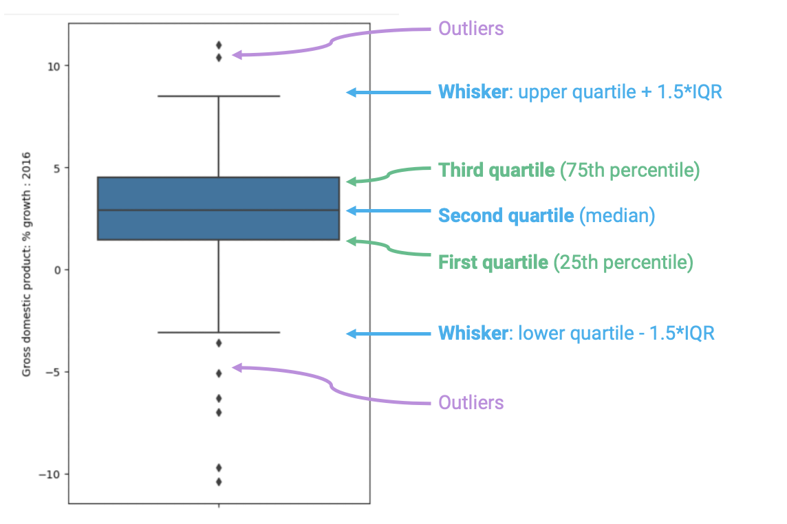
Box plots display distributions using information about quartiles.
A quartile represents a 25% portion of the data.
We say that:
First quartile (Q1)
Repesents the 25th percentile – 25% of the data lies below the first quartile.
In a box plot, the lower extent of the box lies at Q1.
Second quartile (Q2) aka Median
Represents the 50th percentile, also known as the median – 50% of the data lies below the second quartile
In a box plot, the horizontal line in the middle of the box corresponds to Q2 (equivalently, the median).
Third quartile (Q3)
Represents the 75th percentile – 75% of the data lies below the third quartile.
In a box plot, the upper extent of the box lies at Q3.
Inter-Quartile Range (IQR) and Whiskers
In a box plot, the lower extent of the box lies at Q1, while the upper extent of the box lies at Q3. The horizontal line in the middle of the box corresponds to Q2 (equivalently, the median).
The Inter-Quartile Range (IQR) measures the spread of the middle % of the distribution, calculated as the (\(3^{rd}\) Quartile \(-\) \(1^{st}\) Quartile).
\[ IQR = Q3 - Q1 \]
The whiskers of a box-plot are the two points that lie at the [\(1^{st}\) Quartile \(-\)(\(1.5 \times\) IQR)], and the [\(3^{rd}\) Quartile \(+\) (\(1.5 \times\) IQR)]. They are the lower and upper ranges of “normal” data (the points excluding outliers). Subsequently, the outliers are the data points that fall beyond the whiskers, or further than ( \(1.5 \times\) IQR) from the extreme quartiles.
\[ \text{Lower Whisker} = Q1 - (1.5 \times IQR) \]
\[ \text{Upper Whisker} = Q3 + (1.5 \times IQR) \]
Outliers
An outlier is a data point that lies outside the overall pattern of the distribution. In a box plot, outliers are represented as individual points that fall beyond the whiskers.
\[ \text{Outlier} < Q1 - (1.5 \times IQR) \]
\[ \text{Outlier} > Q3 + (1.5 \times IQR) \]
Example
elections.head()| Year | Candidate | Party | Popular vote | Result | % | |
|---|---|---|---|---|---|---|
| 0 | 1824 | Andrew Jackson | Democratic-Republican | 151271 | loss | 57.210122 |
| 1 | 1824 | John Quincy Adams | Democratic-Republican | 113142 | win | 42.789878 |
| 2 | 1828 | Andrew Jackson | Democratic | 642806 | win | 56.203927 |
| 3 | 1828 | John Quincy Adams | National Republican | 500897 | loss | 43.796073 |
| 4 | 1832 | Andrew Jackson | Democratic | 702735 | win | 54.574789 |
from matplotlib import pyplot as plt

fig, axs = plt.subplots(1, 2, figsize=(10, 4))

axs[0].boxplot(elections["Popular vote"], labels=["% Votes"])
axs[0].set_title("Boxplot of Total Votes")
axs[0].set_ylabel("Total Votes")
axs[0].set_xlabel("");

axs[1].hist(elections["Popular vote"], bins=20, edgecolor='black')
axs[1].set_title("Histogram of Total Votes")
axs[1].set_xlabel("Total Votes")
axs[1].set_ylabel("Frequency");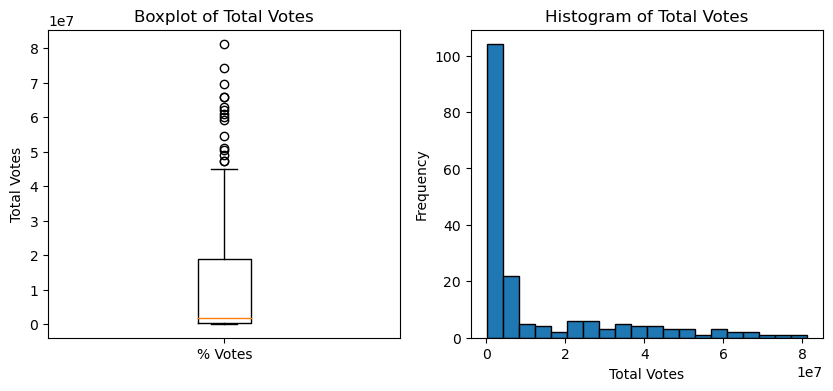
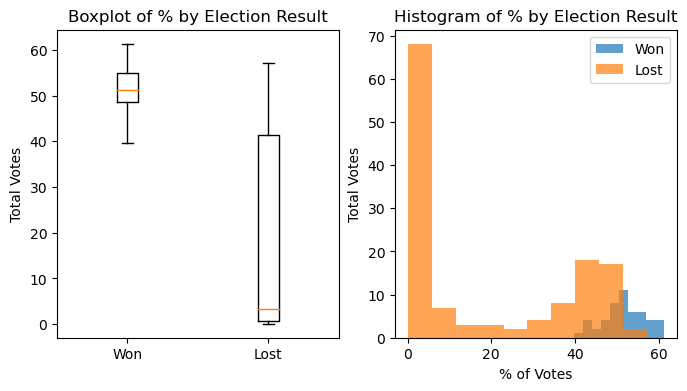
# Box plot for each Result

fig, ax = plt.subplots(1, 2, figsize=(8, 4))

win = elections[elections["Result"] == "win"]
loss = elections[elections["Result"] == "loss"]

ax[0].boxplot([win["%"], loss["%"]],
           labels=["Won", "Lost"],
           showfliers=False);

ax[0].set_title("Boxplot of % by Election Result")
ax[0].set_ylabel("Total Votes")


ax[1].hist(win["%"], alpha=0.7, label="Won", bins=10);
ax[1].hist(loss["%"], alpha=0.7, label="Lost", bins=10);
ax[1].legend();

ax[1].set_xlabel("% of Votes")
ax[1].set_title("Histogram of % by Election Result")
ax[1].set_ylabel("Total Votes")
plt.show()

plt.show()