import matplotlib.pyplot as plt
import pandas as pd

url = "https://raw.githubusercontent.com/fahadsultan/csc272/main/data/elections.csv"

elections = pd.read_csv(url)Bar Plot (Distribution of Discrete / Categorical Data)
A bar plot (or bar chart) is a graphical representation used to display the distribution of discrete numerical or categorical data. It consists of rectangular bars where the length of each bar is proportional to the value it represents. Bar plots are useful for comparing different categories or groups.
Key Features of Bar Plots:
Categories: Each bar represents a different category or group.
Height/Length: The height (or length) of the bar corresponds to the value or frequency of the category it represents.
Orientation: Bars can be oriented vertically or horizontally.
Spacing: There is usually some space between the bars to distinguish different categories.
The following is an example of how to create a simple bar plot using Python’s Matplotlib library:
party_counts = elections.groupby('Party').size()

party_counts = party_counts.sort_values(ascending=False)

categories = party_counts.index
values = party_counts.values

fig, ax = plt.subplots()

ax.bar(categories, values, color='skyblue')
ax.set_xlabel('Party')
ax.set_ylabel('Number of Candidates')
ax.set_title('Number of Candidates by Party')
ax.grid()
ax.set_xticklabels(categories, rotation=90);
/var/folders/l9/y8y3rmys2sl93tzzph3dl7jw0000gr/T/ipykernel_5981/2239138952.py:15: UserWarning: FixedFormatter should only be used together with FixedLocator
ax.set_xticklabels(categories, rotation=90);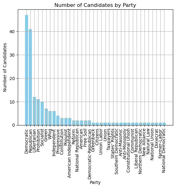
The plot above rotates the x-axis labels for better readability but doing so might crane the neck of the viewer.
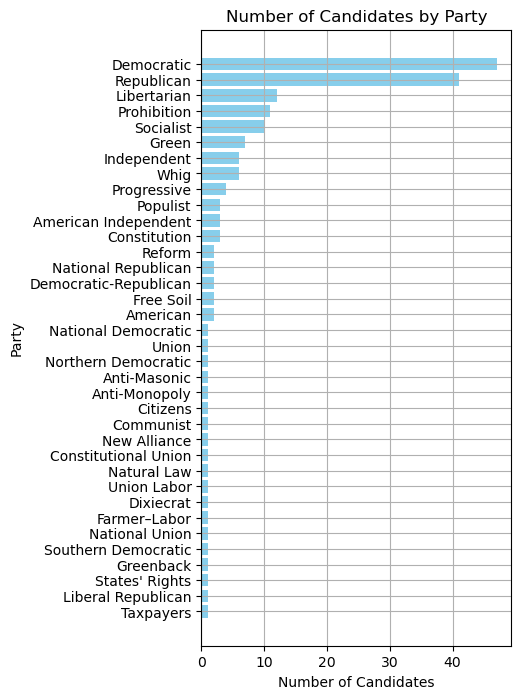
Here is an example of a horizontal bar plot:
party_counts = elections.groupby('Party').size()

party_counts = party_counts.sort_values(ascending=True)

categories = party_counts.index
values = party_counts.values

fig, ax = plt.subplots(figsize=(4, 8))

ax.barh(categories, values, color='skyblue')
ax.set_ylabel('Party')
ax.set_xlabel('Number of Candidates')
ax.set_title('Number of Candidates by Party')
ax.grid();