Scatter plots are a great way to give you a sense of trends, concentrations, and outliers. This notebook will show you how to create scatter plots using Matplotlib.
A scatter plot uses dots to represent values for two (or more) different numeric variables. The position of each dot on the horizontal and vertical axis indicates values for an individual data point. Scatter plots are used to observe relationships between variables.
Scatter plots are used when you want to show the relationship between two variables. Scatter plots are sometimes called correlation plots because they show how two variables are correlated.
Creating a Scatter Plot
To create a scatter plot, we can use the scatter() function from the Matplotlib library. The scatter() function takes two arguments: the x-axis values and the y-axis values.
Here is an example of how to create a simple line plot using the Matplotlib library:
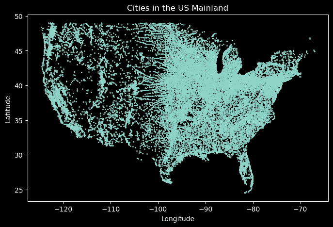
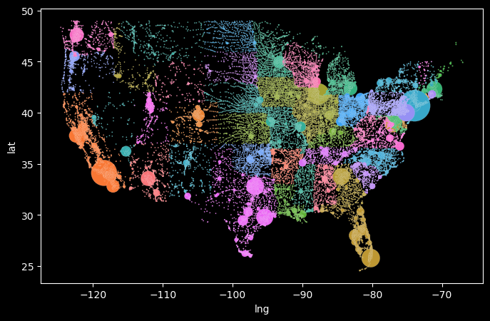
# import librariesfrom matplotlib import pyplot as plt import pandas as pdplt.style.use('dark_background')# load us cities dataurl ='https://raw.githubusercontent.com/fahadsultan/csc343/refs/heads/main/data/uscities.csv'data = pd.read_csv(url)us_mainland = data[(data['state_id'] !='HI') &\ (data['state_id'] !='AK') &\ (data['state_id'] !='PR')]# creating figure and axisfig, ax = plt.subplots(figsize=(8, 5))# scatter plotax.scatter(us_mainland['lng'], us_mainland['lat'], s=1);# setting labels and titleax.set_xlabel('Longitude');ax.set_ylabel('Latitude');ax.set_title('Cities in the US Mainland');
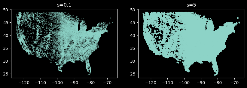
Marker Size
The size of the markers can be adjusted using the s parameter. This parameter controls the size of the markers. The default value is s=20.
The s parameter accepts a scalar or an array of the same length as the number of data points.
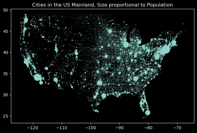
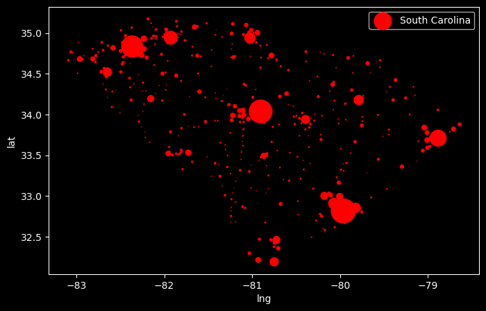
# creating figure and axisfig, ax = plt.subplots(figsize=(8, 5))scaling_factor =1/50_000# scatter plotax.scatter(us_mainland['lng'], us_mainland['lat'], s=us_mainland['population']*scaling_factor);# setting labels and titleax.set_title('Cities in the US Mainland, Size proportional to Population');
Marker Color
The color of the markers can be adjusted using the c parameter. The c parameter accepts a scalar or an array of the same length as the number of data points. This parameter controls the color of the markers. The default value is c='b' (blue).
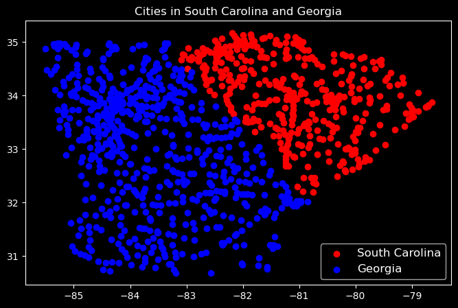
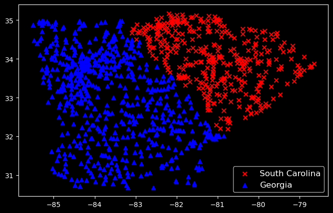
sc = us_mainland[us_mainland['state_id'] =='SC']ga = us_mainland[us_mainland['state_id'] =='GA']# creating figure and axisfig, ax = plt.subplots(figsize=(8, 5))# scatter plotax.scatter(sc['lng'], sc['lat'], c='red', label='South Carolina');ax.scatter(ga['lng'], ga['lat'], c='blue', label='Georgia');# setting labels and titleax.set_title('Cities in South Carolina and Georgia');ax.legend(fontsize=12);
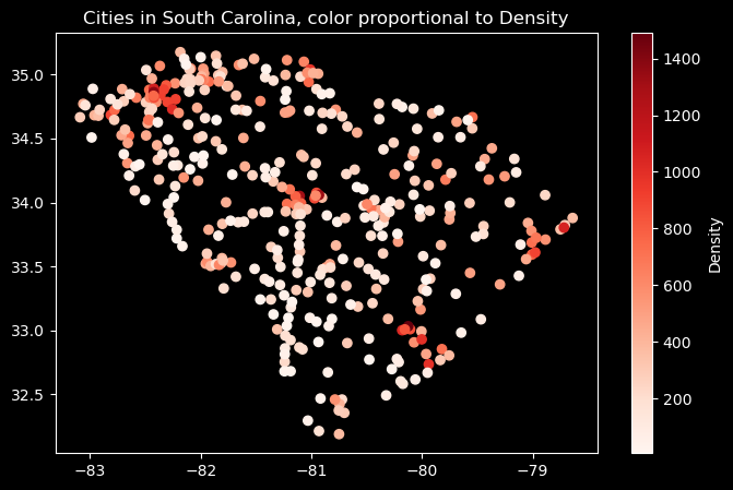
sc = us_mainland[us_mainland['state_id'] =='SC']ga = us_mainland[us_mainland['state_id'] =='GA']# creating figure and axisfig, ax = plt.subplots(figsize=(8, 5))# scatter plotsc_plt = ax.scatter(sc['lng'], sc['lat'], c=sc['density'], cmap='Reds');# setting labels and titleax.set_title('Cities in South Carolina, color proportional to Density');plt.colorbar(sc_plt, label='Density');
Marker Shape
The shape of the markers can be adjusted using the marker parameter. The marker parameter accepts a string that specifies the shape of the markers. The default value is marker=‘o’ (circle).
Here are some of the marker shapes that you can use:
Seaborn is a Python data visualization library based on Matplotlib that provides a high-level interface for drawing attractive and informative statistical graphics. It is built on top of Matplotlib and integrates closely with pandas data structures.
Seaborn often requires less code to create complex visualizations compared to Matplotlib, making it easier to create aesthetically pleasing plots with minimal effort.
As a trade-off, seaborn often does not offer the same level of customization and flexibility as Matplotlib for highly specialized plots.
Scatter plots can be created using the scatterplot() function from the Seaborn library. The scatterplot() function takes two arguments: the x-axis values and the y-axis values.
Note that when using seaborn and pandas, the axis labels are automatically set to the column names of the DataFrame.
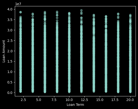
Overplotting occurs when two or more data points are plotted on top of each other. This can make it difficult to see the true distribution of the data. Overplotting can be avoided by adjusting the transparency of the markers using the alpha parameter. The alpha parameter accepts a scalar between 0 and 1. This parameter controls the transparency of the markers. The default value is alpha=1.
data = pd.read_csv('https://raw.githubusercontent.com/fahadsultan/csc272/refs/heads/main/data/loan_approval_dataset.csv')fig, ax = plt.subplots(figsize=(8, 5))ax.scatter(data['cibil_score'], data['income_annum']);ax.set_xlabel('Credit Score');ax.set_ylabel('Annual Income');
Use Scatter for Categorical Data
Scatter plots are used to show the relationship between two numeric variables. If you have categorical data, you should use a different type of plot, such as a bar plot or a box plot.