4.3. Dos and Donts of Visualization#
Distinguishing good vs. bad visualizations requires a design aesthetic, and a vocabulary to talk about data representations.
Here, we will discuss some recommendations for creating effective visualizations, and some common pitfalls to avoid.
4.3.1. Dos ✅#
The following recommendations are Edward Tufte’s Visualization Aesthetic
4.3.1.1. Maximize data ink-ratio#
The data ink ratio is the proportion of the plotting area dedicated to displaying the data. It is defined as:
\(\text{Data-Ink Ratio} = \frac{\text{Data Ink}}{\text{Total ink used in graph}}\)
The goal is to maximize the data ink ratio. In other words, we want to maximize the proportion of the plotting area dedicated to displaying the data and minimize the proportion dedicated to non-data ink.

In the example above, note that both panels show the same data. However, the panel on the right has a higher data ink ratio because it removes the background, the grid lines, and the border around the plotting area.
Similar to the first example, the data shown in both panels of the figure above is the same. However, the panel on the left has a low data ink ratio because it includes needless icons, grid lines and fancy fonts. The panel on the right cleans up the visualization by minimizing all the non-data ink.
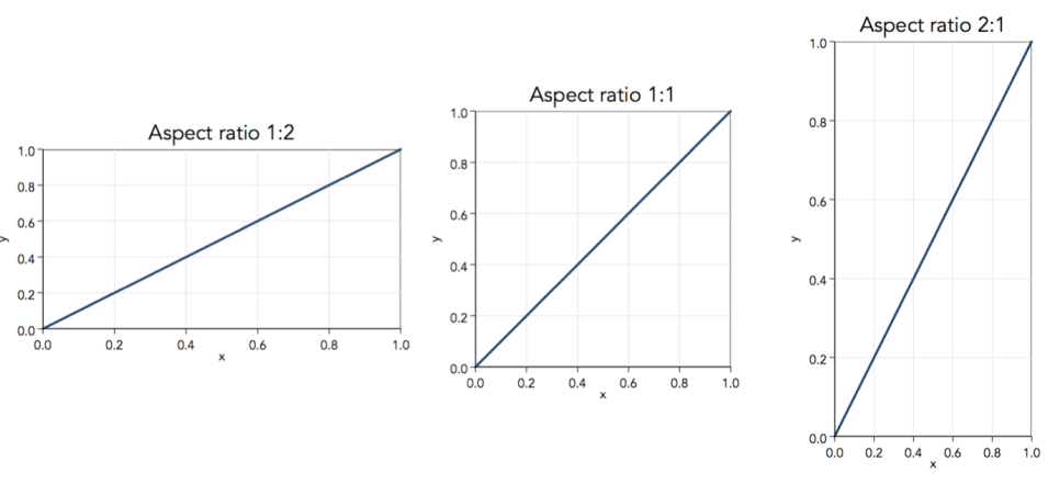
4.3.1.2. Use 1:1 Aspect Ratio#
The aspect ratio of the visualization should be 1:1. In other words, the width of the visualization should be equal to the height of the visualization. This ensures that the data is not distorted.
This is particularly true for line graphs. If the aspect ratio is not 1:1, then the slope of the line will be distorted. The steepness of apparent trends in a line plot is a function of aspect ratio. Aim for 45° lines or Golden ratio (\(\approx 1.618\)) as most interpretable.
4.3.1.3. Bar graphs start at 0#
Bar graphs should always start at zero. If the bar graph does not start at zero, then the differences between the bars will be distorted.
4.3.1.4. Use continuous scales#
The scale of the axes should be continuous. In other words, the scale should be linear or logarithmic. Do not use a scale that is discontinuous or non-linear.
4.3.1.5. Use the right colors#
If the data is categorical, then use qualitative colormaps. If your data ranges from negative to positive values use divergent colormaps. If your data ranges from low to high values, then use sequential colormaps.


4.3.1.6. Order your numerical axes#
The numerical axes should be ordered. For example, if the x-axis represents time, then the x-axis should be ordered from earliest to latest. If the x-axis represents age, then the x-axis should be ordered from youngest to oldest.
Othwerwise, the data will be difficult to interpret as the viewer will not know which data point corresponds to which value on the x-axis. Example of an unordered x-axis:
4.3.2. Donts ❌#
4.3.2.1. Forget to label#
All visualizations should have at minimum contain the following:
A clear and descriptive Title.
All axes should be labeled using name of the variable and the units of measurement.
The axes should also be labeled with the range of values shown.
Legend, if applicable.
Don’t be like this guy:
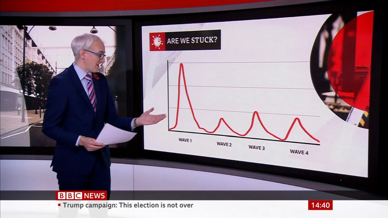
Note that the figure above is missing axis labels. No, “wave1”, “wave2”, “wave3” and “wave4” are not proper labels for the x-axis. “Are we stuck?” is also not a very informative title.
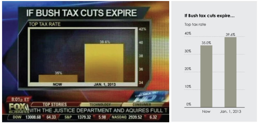
4.3.2.2. Scale Distortion#
The scale of the effect in the graphic should match the scale of the effect in the data. In other words, the difference in size of the graphics should be proportional to the difference in values in the data.
\( \text{Scale Distortion} \rightarrow \text{size of effect in graphic} \neq \text{size of effect in data}\)
4.3.2.3. Use uneven ranges#
If ranges are not equal, then you can essentially tell any story with the data you want. Catching this is difficult, but it is a common trick deliberately used to mislead the viewer.
4.3.2.4. Use line graphs where the x-axis is not time#
Plotting a line graph where the x-axis is not time is confusing. Use a bar graph instead.
4.3.2.5. Use the wrong colors#
If the data is categorical, then use qualitative colormaps. Do not use sequential colormaps.
4.3.2.6. Use 3D#
Please. Just. Don’t.