4. Visualizing Data#
Visualizing data is a key part of data science. It is not only a way to communicate your findings to others but, more importantly, it is a way to understand your data, models and algorithms better.
In this section, we will learn how to use the libraries matplotlib and seaborn to create visualizations.
matplotlib is the primary plotting library in Python. It is a very powerful and highly customizable library that can be used to create a wide variety of plots and graphs. However, despite its power, is can often be not very user-friendly, requiring a lot of code to create even simple plots.
seaborn is a data visualization library built on top of matplotlib that is easier to use and creates more visually appealing plots. I will try to use seaborn whenever possible, but may have to fall back occasionally to matplotlib for formatting details and customization.
Just as pandas is conventionally imported as pd, matplotlib.pyplot is conventionally imported as plt and seaborn is conventionally imported as sns.
Let’s start by importing the libraries we will need.
import pandas as pd
from matplotlib import pyplot as plt
import seaborn as sns
There has long been an impression amongst academics and practitioners that “numerical calculations are exact, but graphs are rough”. In 1973, Francis Anscombe set out to counter this common misconception by creating a set of four datasets that are today known as Anscombe’s quartet.
The code cell below downloads and loads it as pandas DataFrame this data set:
anscombe = sns.load_dataset("anscombe")
anscombe.head()
| dataset | x | y | |
|---|---|---|---|
| 0 | I | 10.0 | 8.04 |
| 1 | I | 8.0 | 6.95 |
| 2 | I | 13.0 | 7.58 |
| 3 | I | 9.0 | 8.81 |
| 4 | I | 11.0 | 8.33 |
Now let’s see what the summary statistics of x and y features look like, with respect to dataset feature:
anscombe.groupby("dataset").describe()
| x | y | |||||||||||||||
|---|---|---|---|---|---|---|---|---|---|---|---|---|---|---|---|---|
| count | mean | std | min | 25% | 50% | 75% | max | count | mean | std | min | 25% | 50% | 75% | max | |
| dataset | ||||||||||||||||
| I | 11.0 | 9.0 | 3.316625 | 4.0 | 6.5 | 9.0 | 11.5 | 14.0 | 11.0 | 7.500909 | 2.031568 | 4.26 | 6.315 | 7.58 | 8.57 | 10.84 |
| II | 11.0 | 9.0 | 3.316625 | 4.0 | 6.5 | 9.0 | 11.5 | 14.0 | 11.0 | 7.500909 | 2.031657 | 3.10 | 6.695 | 8.14 | 8.95 | 9.26 |
| III | 11.0 | 9.0 | 3.316625 | 4.0 | 6.5 | 9.0 | 11.5 | 14.0 | 11.0 | 7.500000 | 2.030424 | 5.39 | 6.250 | 7.11 | 7.98 | 12.74 |
| IV | 11.0 | 9.0 | 3.316625 | 8.0 | 8.0 | 8.0 | 8.0 | 19.0 | 11.0 | 7.500909 | 2.030579 | 5.25 | 6.170 | 7.04 | 8.19 | 12.50 |
Note that for all four unique values of dataset, we have eleven (x, y) values, as seen in count.
For each value of dataset, x and y have nearly identical simple descriptive statistics.
Now let’s create a scatter plot of the data using seaborn:
g = sns.FacetGrid(anscombe, col="dataset");
g.map(sns.scatterplot, "x", "y", s=100, color="orange", linewidth=.5, edgecolor="black");
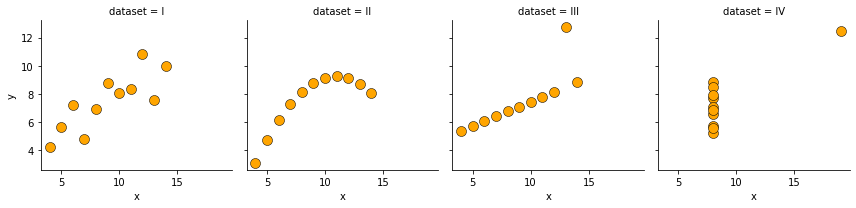
Anscombe’s quartet demonstrates both the importance of graphing data before analyzing it and the effect of outliers and other influential observations on statistical properties.
Data Visualization is arguably the most mistake-prone part of the data science process. It is very easy to create misleading visualizations that lead to incorrect conclusions. It is therefore important to be aware of the common pitfalls and to avoid them.
The following is a useful taxonomy for choosing the right visualization depending on your goals for your data:
